Product-market fit meaning: a plain-English definition for founders (+ free cohort retention chart builder)
Product-market fit meaning, in plain words: a retention curve that stops falling. How to read yours, and why a curve that falls to zero often means the wrong customers, not a bad product.

I'm Jurģis - community & brand lead at BADideas.fund. This issue kicks off a new format for the newsletter: each week we take one bit of startup jargon and gut it: what it means, what everyone gets wrong, and what to do about it.
Product-market fit is when a group of customers keeps coming back without you pushing them. It shows up as cohort retention that flattens, not as a good launch week. Take everyone who signed up in the same week, track what share are still active at weeks 1, 2 and 6, and read the shape. If the curve settles onto a plateau, even a low one, you have fit with somebody. Google Photos flattened between 20% and 40% depending on country and device, and that was enough to build on. If the curve slides toward zero, you do not have fit, and adding signups will hide that for roughly two quarters. The second half of the answer matters more: a bleeding curve is not automatically a verdict on your product. Often you are acquiring the wrong users, and that has a completely different fix. There is a free tool further down this page that builds the chart and the segment split from your own data, in your browser.
Every founder I meet says they have early product-market fit. Very few can say what would prove them wrong. So here is a clear test, and then the question that decides what you do today.
Product-market fit meaning: the one-line definition
Product-market fit is when the market pulls the product out of your hands. People adopt it, keep using it, and tell other people, without you in the room. The cleanest working test I have heard comes from Jason Cohen, who founded Smart Bear and WP Engine. When he diagnoses a company that has stopped growing, he does not open with revenue or pipeline. He opens with whether customers stay:
"Step one is this logo retention, essentially do we have product market fit?"
Retention first. Then pricing and positioning. Then growth. The order matters. If you spend on getting new users before you know they stay, total numbers go up while last month's users quietly leave.
Product-market fit shows up as a curve
You do not reach fit on one day. You see it in a chart over time. Group users by the week they arrived, then chart what share are still active 1, 2 and 6 weeks later. You are looking for the curve to stop falling. A curve that flattens means a real group of people found lasting value and stayed. A curve that falls to zero means people try the product and leave. The Y Combinator Startup School session on retention puts the test in one sentence:
"If your curves don't flatten out, I would say it's a pretty good sign that you haven't yet made something people want."
Two details decide whether your chart tells you the truth. First, the window has to match how the product is meant to be used: daily for high-frequency products, weekly or monthly for a utility someone opens when a specific job appears. Measure a monthly tool on daily retention and a healthy product looks dead. Second, you need to know which single action predicts that someone comes back. Sarah Tavel, a partner at Benchmark who was early at Pinterest, calls it the core action:
"It's an action that if they perform the action they're very likely to come back."
For Facebook that action was friending. For Pinterest, pinning. Before fit, most of your work is finding your version of that action and getting more new users to reach it, sooner.
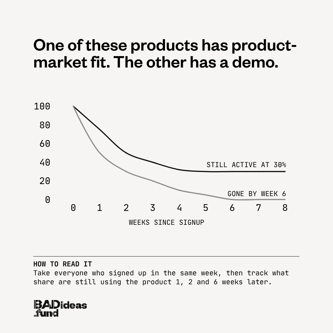
In the chart, one cohort flattens with about 30% of users still active. The other is gone by week 6.
Bad retention is often not a product problem
Most founders lose time here. A curve that bleeds to zero gets read as a product verdict. The founder concludes the product is not good enough, and goes back to building. Six months of roadmap later, the curve looks the same.
Sometimes the product genuinely is the problem. Often it is not. The same Y Combinator session names the other cause directly:
"You've built a great product but you're targeting it to the wrong type of customer."
If you bring in the wrong users for a product that works for a smaller group, the overall curve keeps falling, however good the software is. Better code will not fix it. It is in who you acquire and what you say to them, which is a go-to-market problem with go-to-market levers: the ICP definition, the message, the channel, the sequence in which you test them.
This is what BADideas.fund is built on. At seed, great founders with real direction still die, and they rarely die on the product or on what they believe. They die on go-to-market: on which experiments they run, in what order, and how well they run them. Going from your first few customers to a repeatable way of getting hundreds more is the main job before your next round. Guess wrong about how you will do that and the company can die before the product gets a fair test.
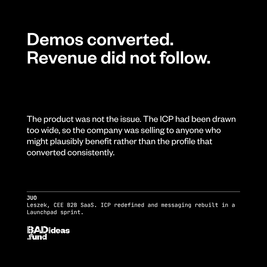
The practical version, before you touch the roadmap: split the curve. Chart retention separately by segment, by acquisition channel, and by how the user arrived. If one segment flattens at 35% while the blended average bleeds, you do not have a product problem. You have a targeting problem, and you have just found the customer you should be building the company around. One founder in our portfolio, Leszek at Juo, had demos converting well and revenue refusing to follow. The product was not the issue. The ICP had been drawn too wide, so the company was selling to anyone who might plausibly benefit rather than the profile that converted consistently. Redefining that ICP, rebuilding the messaging around it, and sequencing the path from interest to revenue is what moved the numbers.
Why founders hide bad retention for three months
There is a second reason founders misread the curve, and it has nothing to do with analytics. Naming a retention problem out loud has a cost, especially to the person who wrote you a cheque.
On a Tuesday morning a founder drafts three sentences to his investor about why the ICP is not working and conversion is down. He reads them back, decides the investor will not know what to do with this, deletes them, and sends something manageable instead. The real situation does not get named until it is three months old and considerably harder to fix. At seed, three months is a long time. Martin, who runs Fleetfox, described the dynamic without being asked:
"With other VCs I feel like I have to draft a message and make sure I don't say anything wrong."
That instinct is rational when your investor asked for a five-year projection on a four-month-old product. It is also the mechanism by which a fixable retention problem becomes a fatal one. If a founder only shares good news, the investor sees only part of the problem and cannot help fix it. If you are reading your own curve this week, the useful question is not only what the chart says. It is who you can show it to on Tuesday instead of in October.
How to measure it honestly
Three practices, drawn from what consistently shows up across Cohen, Tavel and the Startup School material.
- Start with cohort retention, not revenue. One chart: rows are signup week, columns are weeks since signup, cells are the share still active. It answers the fit question more honestly than anything else on your dashboard, and the tool below will build it from whatever export you already have.
- Name your comeback action and instrument it. Write down the single behaviour that predicts a return visit, measure what share of new users reach it, and treat "more new users to that action, sooner" as the job until the curve flattens.
- Segment before you conclude. Never act on a blended curve. Split by channel and customer type first, because the blended average is what turns a targeting problem into a rebuild.
What matters most across all three: how many real ideas you can test in a week, and how fast you change course when customers answer. Founders close to the problem do not just run more experiments, they run better ones, because they know which hypotheses are worth testing at all.
The tool of the week: a cohort retention chart builder
The third of those practices, segmenting before you conclude, is the one founders skip. It is not hard to understand, just slow: you build the chart in a spreadsheet, then repeat it for every segment. So we built it instead.
It needs two columns: a user id and a date. Activity means whatever counts as using your product, so a login, a session, an order, an invoice or an API call all work. If you have a signup date, map it and the tool uses it. If you do not, it takes each user's first activity as their cohort. Add an optional third column, a segment such as plan, channel, country or industry, and it does the part this article is actually about: it draws the blended curve, splits it by segment, and tells you when the two disagree. On the sample data it reports that self-serve holds at 35% while outbound falls to 2%, and that the blended 17% describes neither of them.
Two things worth knowing before you paste anything in. It runs entirely in your browser, so your customer data is never uploaded and the page works offline once loaded. And it excludes cohorts that have not lived long enough to reach a given week rather than counting them as zero, which is the most common way a hand-built retention chart flatters you.
What to do this week
- Build one cohort retention chart, using the tool above or a spreadsheet, and look only at whether week 6 is flat or falling. Ignore the absolute number for now.
- Split that chart by acquisition channel and by customer type. If any single segment flattens, stop planning product work and go read that segment.
- Write down your comeback action and the share of new users who reach it. If you cannot name the action, that is this week's work.
- Send the Tuesday email. Whatever the curve says, tell the person who funded you now rather than in three months.
Frequently asked questions
Product-market fit means your product satisfies real demand strongly enough that a group of customers keeps using it without being pushed. In practice it shows up as cohort retention that flattens onto a plateau rather than decaying toward zero.
Work with BADideas.fund
We are an early-stage fund in CEE. We back founders whose ideas sound wrong to most people at first. We are ex-founders, and our thesis is the one running through this piece: seed companies rarely die on the product or on what the founder believes, they die on go-to-market, on which experiments they run, in what order, and how well they run them. So that is where we go all in. Within weeks of closing, every company runs a structured go-to-market diagnostic, and when it surfaces a specific problem, a named operator who has run that exact function before, in outbound, growth or product-led, is briefed and in the room. You know your customer. We help you turn that into the right test, in the right order, faster than you would alone.
Related questions
Send the deck. We read every one.
Yes or no in five business days, with the reason either way.